LOGOS & BRANDING
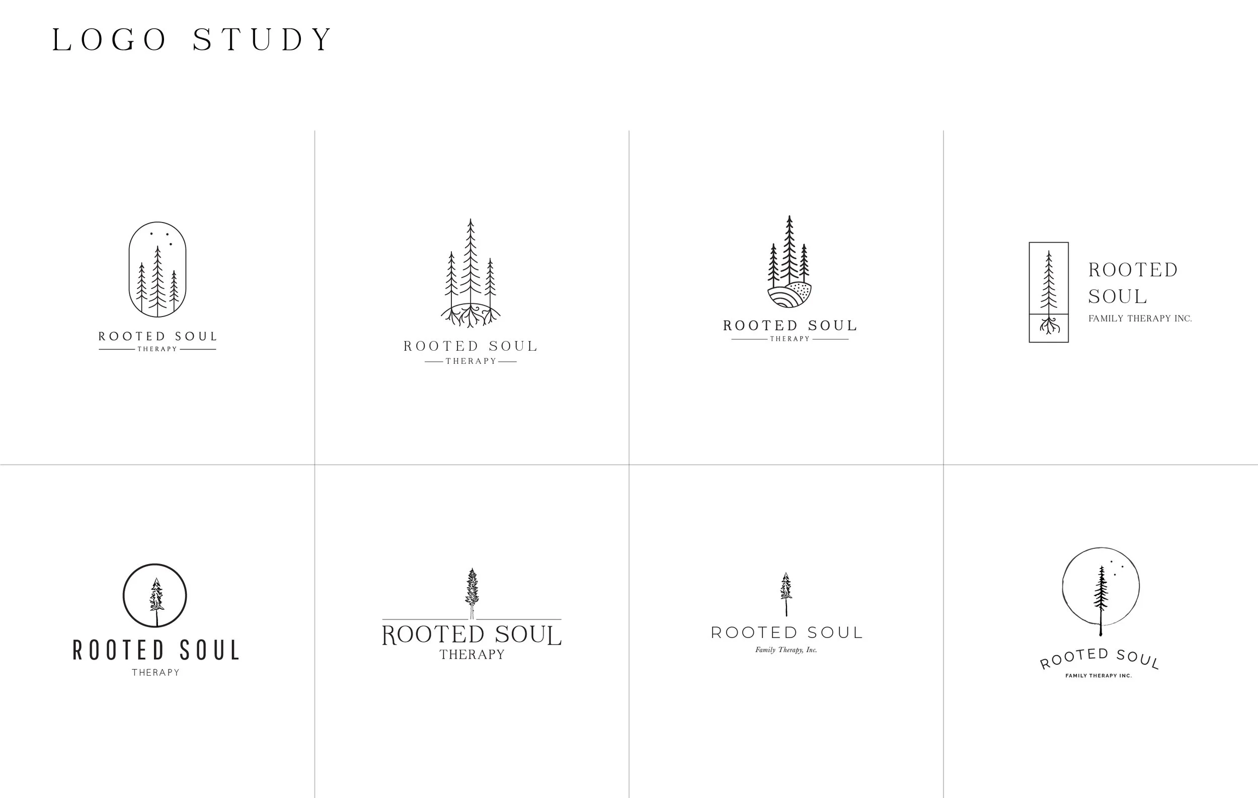
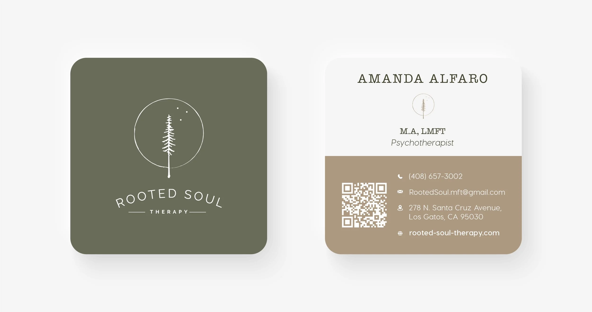
Rooted Soul Therapy
Rooted Soul Therapy was a labor of love for a very dear friend taking the leap and starting her own therapy practice. We started from scratch, gathering inspiration for her brand from the beautiful redwoods of Northern California. Rooted Soul is a brand still evolving but will always be grounded in hope, balance, and purpose.
Amingu
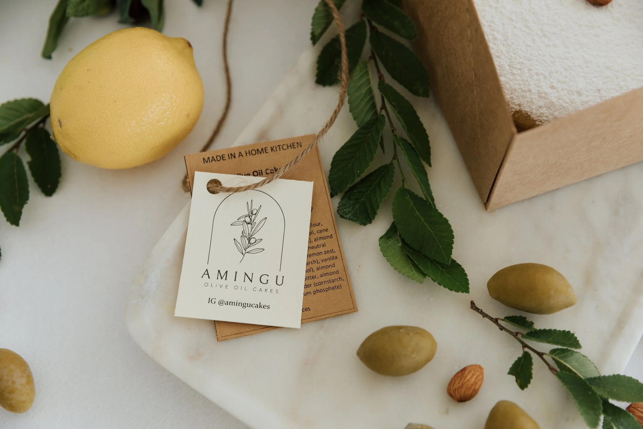
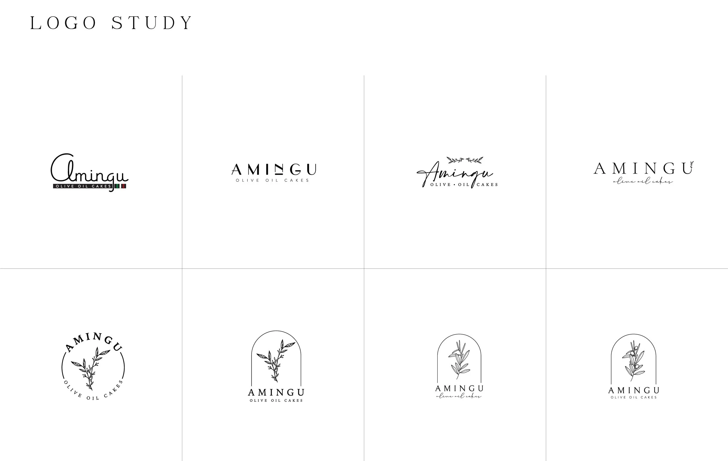
When your friends want to start baking cakes, you absolutely agree to make a logo for them. The vision was clear: Italian summer, fresh almonds, and powdered sugar. The Amingu brand came together effortlessly as we showcased their core ingredient, the olive, with a splash of timeless Italian charm.
Thrive in 25
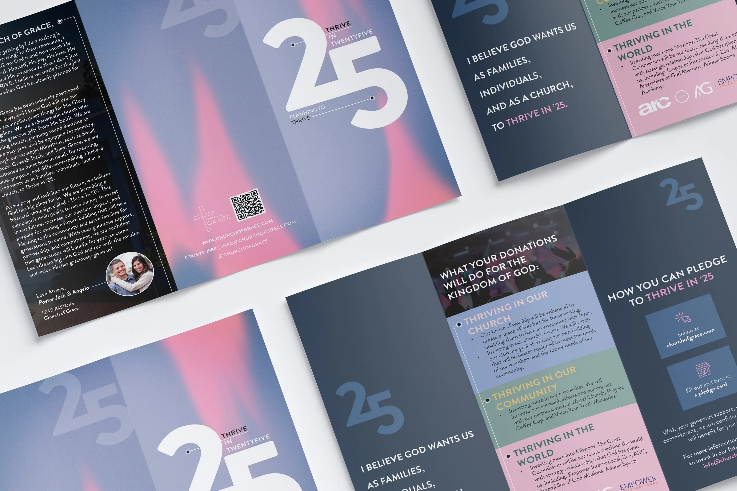
Thrive in 25" is a marketing campaign launched by Church of Grace to energize the community around the exciting transformations planned for 2025. I was brought on to develop the campaign’s brand identity and create a suite of marketing materials designed to educate the congregation and inspire action. The project began with a bold, impactful logo and quickly expanded to include large-scale banners, informational pamphlets, and eye-catching posters strategically placed throughout the church.
Church of Grace
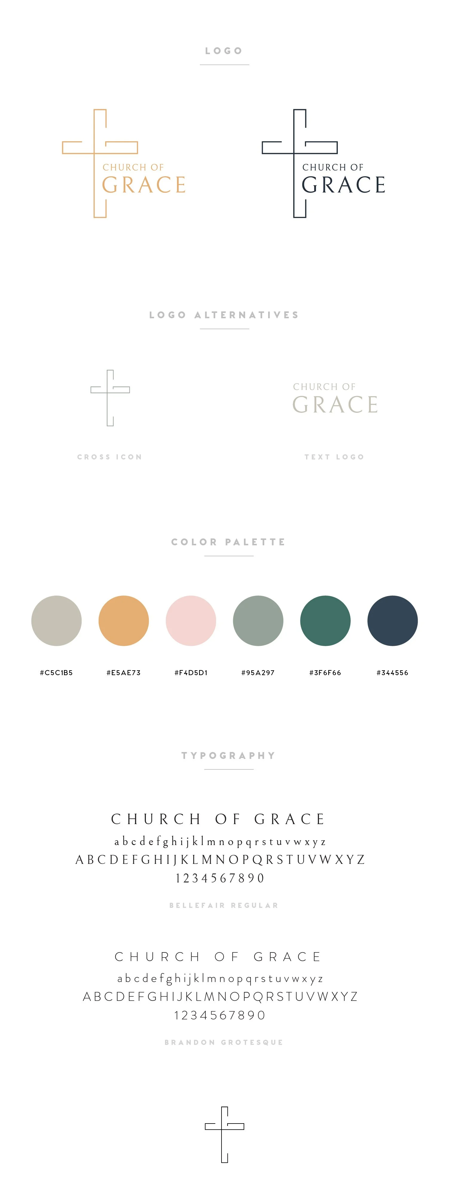
After working with the existing logo for years, we decided Church of Grace needed a rebrand. It has been a slow and steady rollout, but we have a solid foundation with this minimal and timeless logo; merging old and new with a subtle nod to the Church of Grace initials.
Church OC
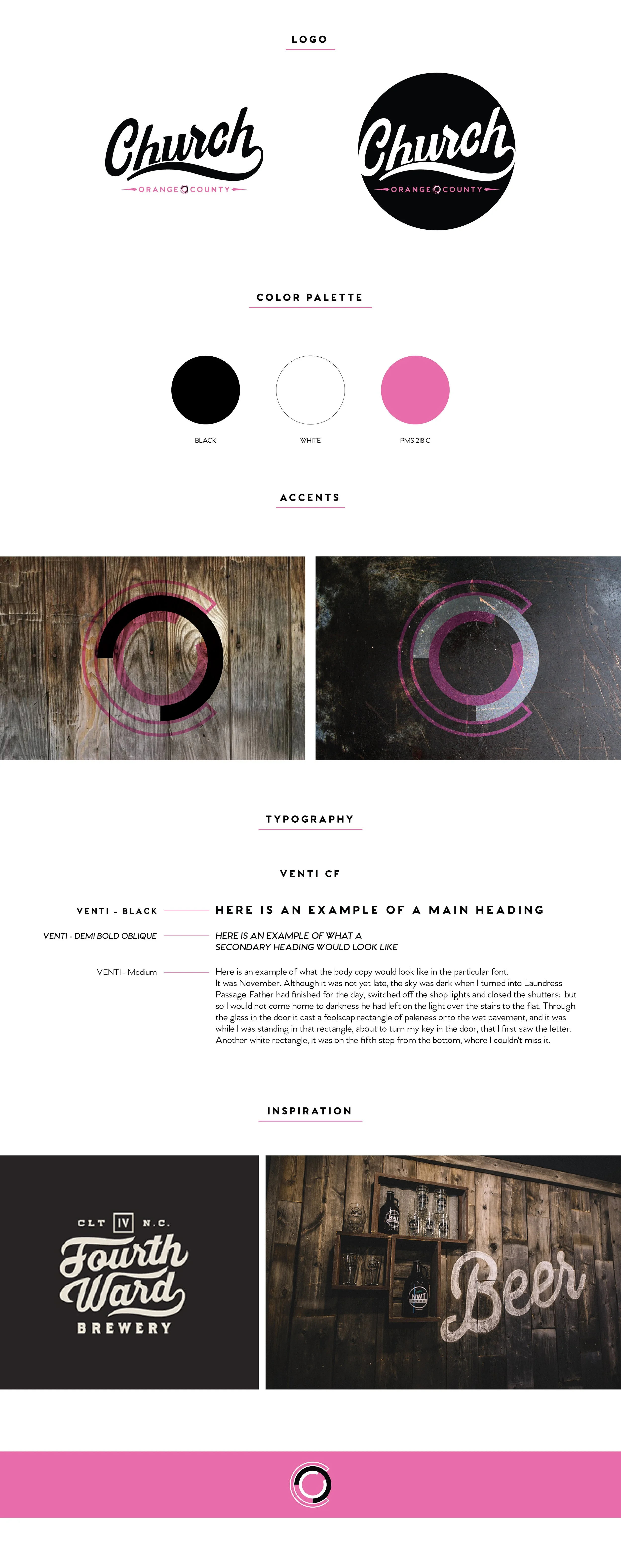
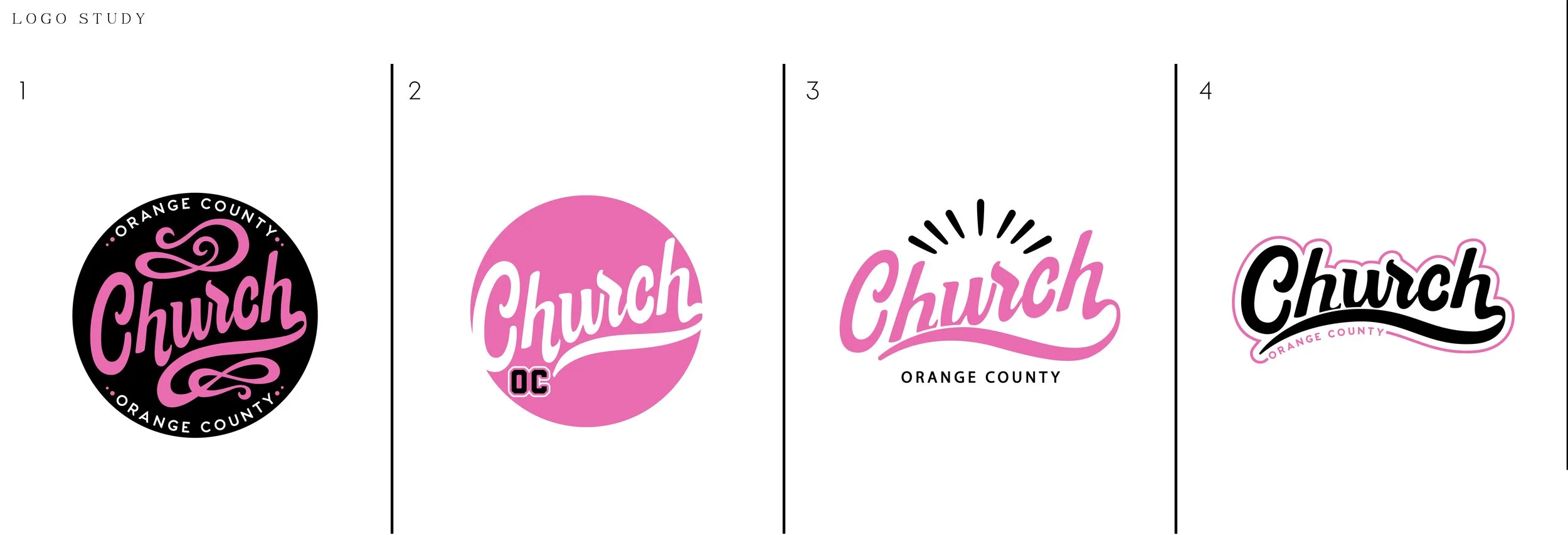
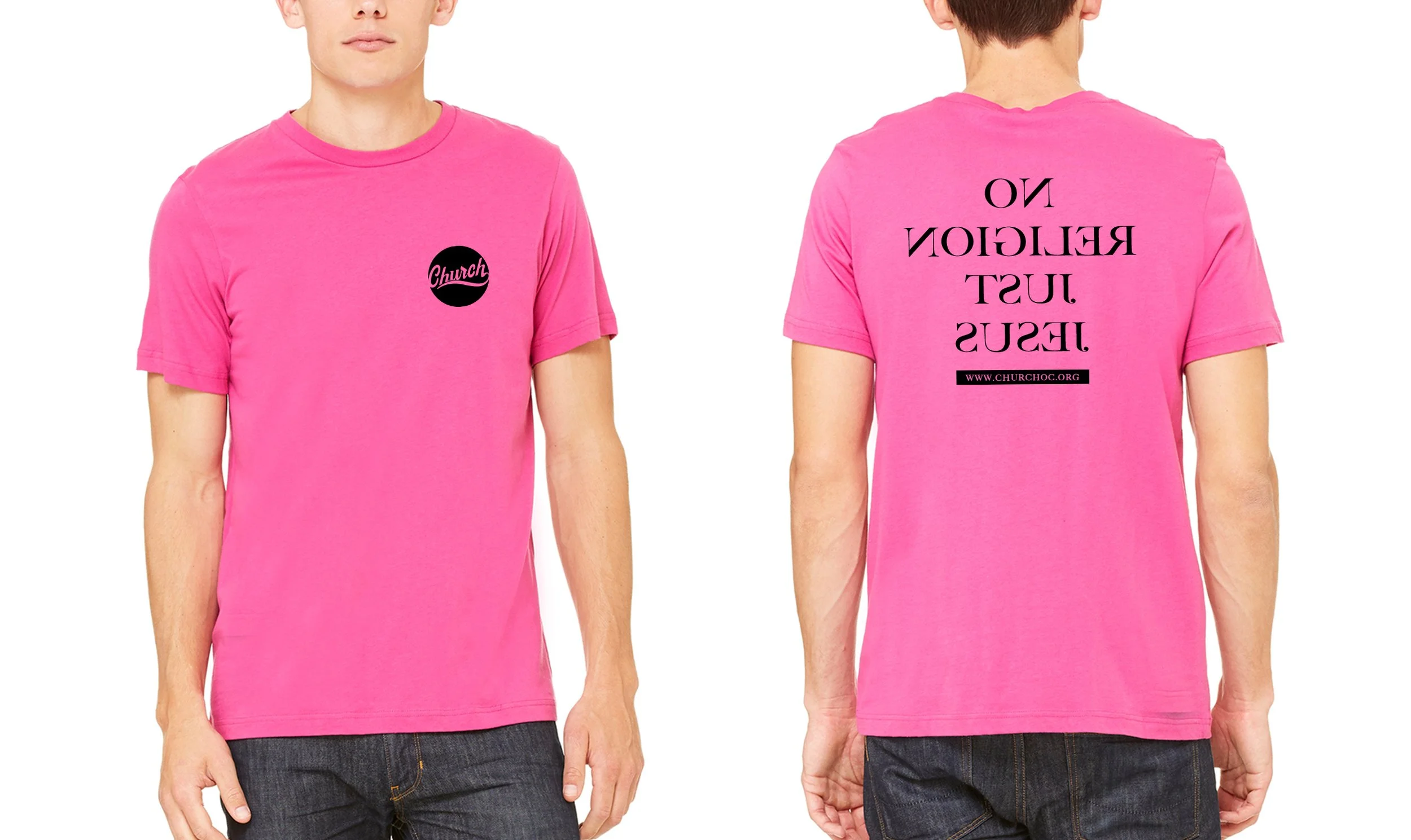
Church OC started as just an idea and turned into so much more. A dear friend started his own church and needed everything: branding, a website, signage- the works. We dove in head first to build out all we could, relying on friends and family when we couldn’t do it ourselves (shout out to master illustrator and typographer @joelz for creating the base sketches for the word “church”). This branding carried us until we outgrew it and became Church of Grace.
Mesa Interiors
Mesa Interiors was a Costa Mesa-based family-owned upholstery business intended to be passed down to a new generation. We worked on a huge rebrand, starting with a new logo and website until the partnership ultimately dissolved, but not before some sleek and modern ideas were created.
ART
This rebranding concept for Anaheim Resort Transportation (ART) was developed at ICG, where I created multiple logo options and visualized them on actual ART buses. The rebranding process had strict guidelines on height, length, and detail, which I adhered to closely while meeting the client’s specific design requests for the updated look.
Dainty Mobile Wagon
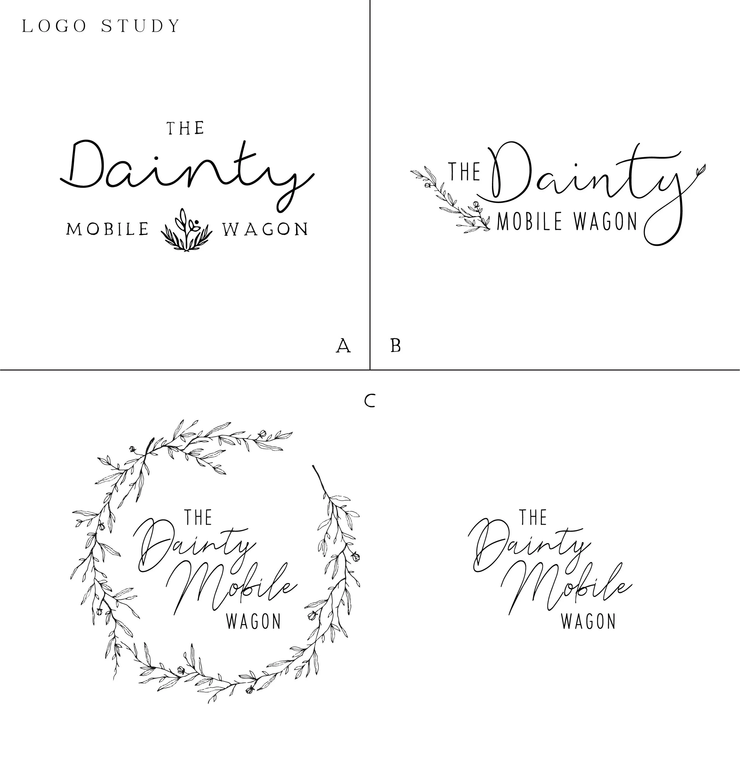
A friend of a friend needed a logo for her new mobile service venture. The Dainty Mobile Wagon branding could best be described as elegant, feminine, and earthy. I was excited to be a part of this project since most of my logos lean into a different aesthetic. We created something I still love and even though the company is no more, the vision and mood of this brand are some of my favorites.
Loma Alfaro
Loma Alfaro is a logo dedicated to a warm, inviting household filled with love, music, laughs, and movie nights. This home’s logo is soon to be expanded to many ventures and we are excited to see where this branding takes us.
Limitless
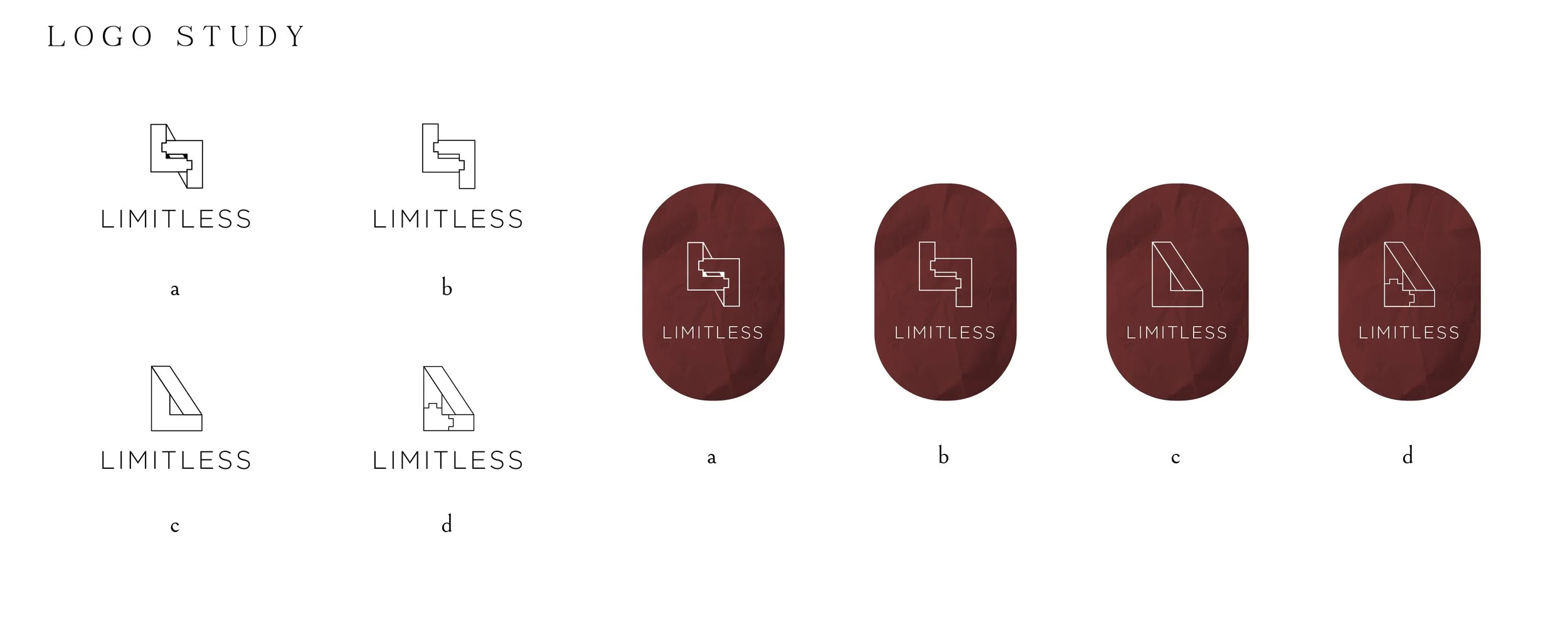
This church small group logo was requested to be something that would represent the interconnectedness of all the young adult members in the group. It was created quickly, efficiently, and simply - the best way to do it. Maybe one day we will see it on a hat or sweatshirt, but for now, it looks great on sign-up sheets and outreach postcards.

